Spending Analysis — Pivot Tables & YoY Comparison
Overview
Section titled “Overview”The Analysis page provides advanced spending analysis with interactive pivot tables, heatmaps, year-over-year comparisons, and accounting-style statements. It has three tabs: Trends (all tiers), Monthly YoY (Pro), and P&L (Pro).
Trends Tab
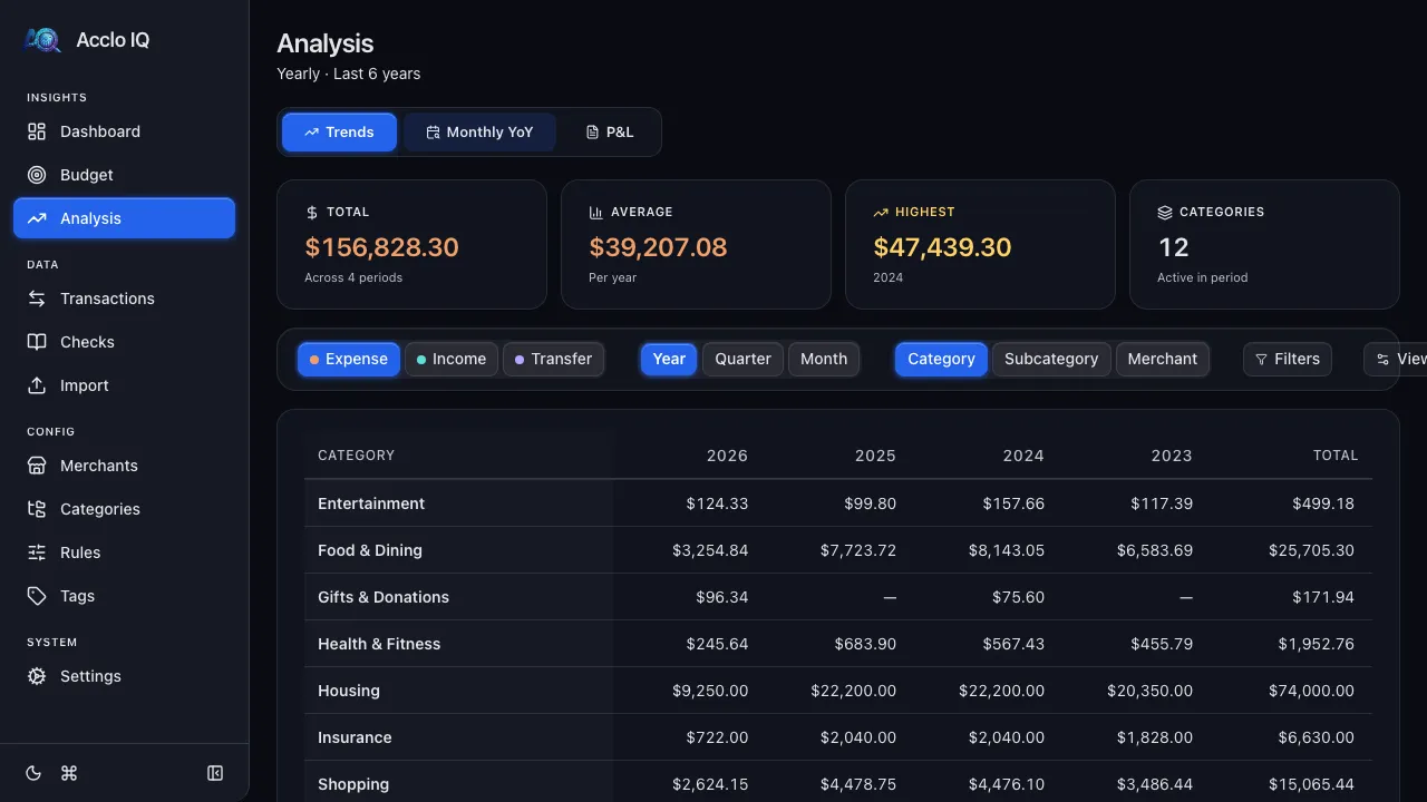
Section titled “Trends Tab”Summary Cards
Section titled “Summary Cards”Four cards across the top:
- Total — aggregate spending/income across all visible periods
- Average — per-period average
- Highest — peak period with label
- Categories — count of active categories
Amount Mode
Section titled “Amount Mode”Choose what to analyze with the mode pills:
- Expenses — spending only
- Income — income only
- Cash Flow — net of income minus expenses
Granularity
Section titled “Granularity”Choose the time granularity:
- Year — annual totals
- Quarter — quarterly totals
- Month — monthly totals
Detail Level
Section titled “Detail Level”Toggle which hierarchy levels appear in the table:
- Category — top-level categories
- Subcategory — subcategory rows within each category
- Merchant — individual merchant rows
Pivot Table
Section titled “Pivot Table”The main table shows amounts organized as a grid:
- Rows — categories, subcategories, and/or merchants (collapsible hierarchy)
- Columns — time periods (years, quarters, or months)
- Cells — spending amounts
Click any cell to drill down to the matching transactions.
Heatmap
Section titled “Heatmap”Toggle the Heatmap option in the View settings to color-code cells by relative spending intensity. Higher amounts show warmer colors, making patterns easy to spot.
Percentage Change
Section titled “Percentage Change”Toggle % Change to show period-over-period change percentages alongside absolute amounts.
Filters
Section titled “Filters”Use the Filters drawer to narrow the analysis by account, category, subcategory, or merchant.
Export
Section titled “Export”Click Export in the toolbar to download the current pivot table as CSV or Excel (.xlsx). Check "Current view" to apply active filters, or uncheck it to export all data.
Period Range
Section titled “Period Range”Free tier: up to 12 months, 4 quarters, or 1 year. Pro tier: up to 24 months, 20 quarters, or 10 years. Adjust with the slider in View settings.
Monthly YoY Tab (Pro)
Section titled “Monthly YoY Tab (Pro)”The Year-over-Year tab compares the same month across multiple years — for example, comparing February spending in 2024, 2025, and 2026.
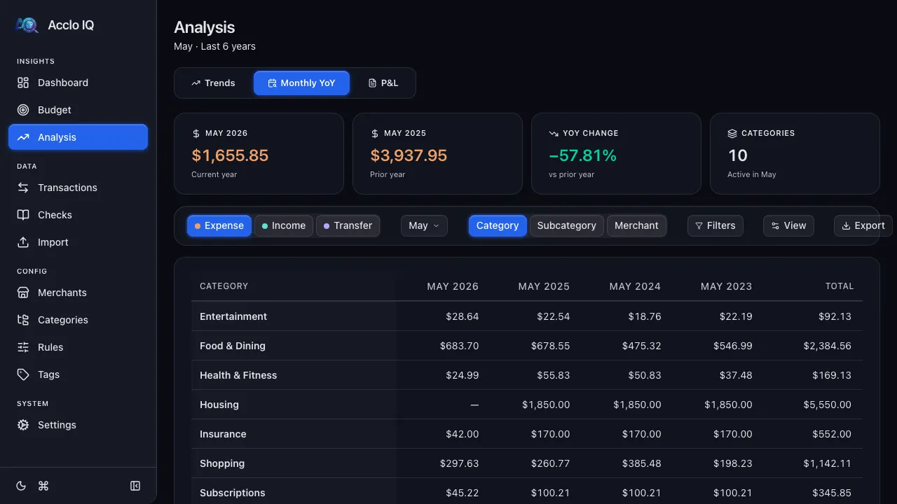
Controls
Section titled “Controls”- Month selector — choose which month to compare (January through December)
- Years slider — how many years to include (2–20)
- Amount mode — Expenses, Income, or Cash Flow
- Detail pills — Category, Subcategory, Merchant
The pivot table shows the selected month's data for each year as columns, with the same hierarchical row structure as the Trends tab. Heatmap and percentage change options are also available.
P&L Tab (Pro)
Section titled “P&L Tab (Pro)”A monthly snapshot of what came in, what went out, and what's left. Useful for two questions:
- "Am I saving anything?" — see how much income is left after all expenses each month, quarter, or year
- "Is my side hustle profitable?" — filter to a single account or category set for a tax-ready Profit & Loss view you can export and share
The P&L tab (Profit & Loss, also called a Statement of Activity) presents the same numbers you see elsewhere in Acclo IQ, arranged the way an accountant would.
Layout
Section titled “Layout”The table has three sections, each collapsible:
- Income — categories whose subcategories are tagged as income (paychecks, dividends, refunds)
- Expenses — categories whose subcategories are tagged as expenses (groceries, rent, subscriptions)
- Net Income — what's left over (income minus expenses). Positive = you saved, negative = you spent more than you earned
Categories with mixed subcategories (e.g., Uncategorized) appear in both sections with only the matching subcategories shown.
Summary Cards
Section titled “Summary Cards”Four cards across the top:
- Total Income — everything earned across the visible periods
- Total Expenses — everything spent across the visible periods
- Net Income — the bottom line, color-coded green (positive) or red (negative)
- Categories — count of active categories in the period
Controls
Section titled “Controls”- Granularity — Year, Quarter, or Month
- Detail level — Category, Subcategory, Merchant (same hierarchy as Trends)
- Periods slider — how many periods to display side by side
- Heatmap and % Change — same visualization options as Trends
- Filters — narrow by account, category, subcategory, or merchant
- Export — download as CSV or Excel for taxes, sharing with an accountant, or your own records
Free vs Pro
Section titled “Free vs Pro”The P&L tab requires a Pro license. Free tier users see an upgrade prompt. Period limits match the Trends tab: Free covers 12 months, Pro covers full history.
Related Guides
Section titled “Related Guides”- Dashboard — quick overview of current-period spending
- Budgets — track spending against targets
- Transactions — drill down to individual transactions
- Licensing — Monthly YoY and extended periods require Pro